Value Shapes
|
|
|
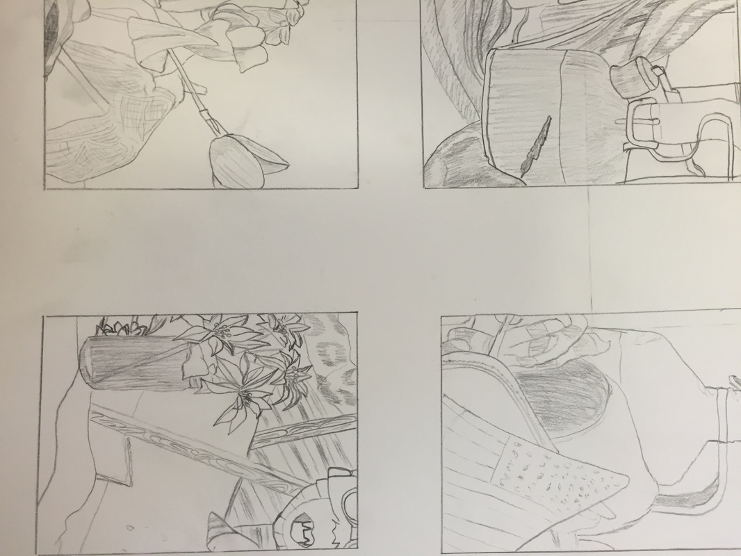 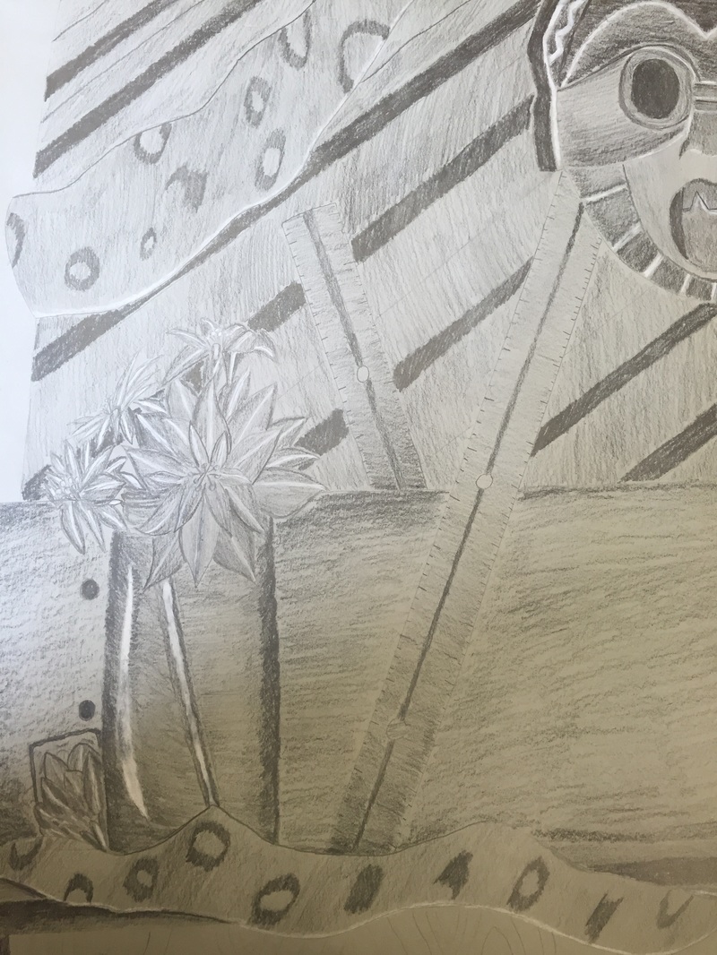 My drawing was crafted with the intent of defining areas such as highlighting the lines within the objects. I erased any smudging to help define this even more and I tried to include as many values to piece as I could. The darkest were saved for areas like the mask’s eyes and mouth or the glass the flowers were in. I added dark values for the table under it as well. The values in this piece are important to contrast the different shapes I had such as defining the mask from the nearby ruler or the different pieces of cloth. Given that my piece was directly facing the light I had a hard time defining the light over the dark. I used a white Prisma colored pencil to provide highlights and to separate that light and dark when need be. The compositional sketches where of great importance to me. I wanted to have an object that would catch an onlooker’s eye and looked all around our still life to find something of interest. I choose the flowers as this point. I think I achieved success in my drawing by focusing on the details of my object in the drawing. These were more important to me than the background and I think I achieved this pretty well. I think I achieved success in my drawing by focusing on the details of my object in the drawing. These were more important to me than the background and I think I achieved this pretty well. When creating this piece I wanted to have a close up of the objects. While they were bigger compared to where I was, they were proportionate if close up. The placement of the objects were scattered about the piece to allow the audience to explore at their own pace. I didn’t place them all in one area as this would overwhelm someone looking at it. My center of interest was placed on the flowers to the left of the middle. I didn’t want to have anything going on in the middle to allow the audience’s eyes to move to more interesting parts. I tried to be sparing in what I had to work this but time was not an area I was good with. I definitely need to improve on how to put time aside for pieces like this. As per usual, time is never on anyone’s side. It certainly wasn’t with me as I rushed a bit to finish the details on the skateboard’s rough surface. I have learned that drawing a still life is not as easy as it sounds. While it is not moving, it makes it all the more important to capture detail and texture.
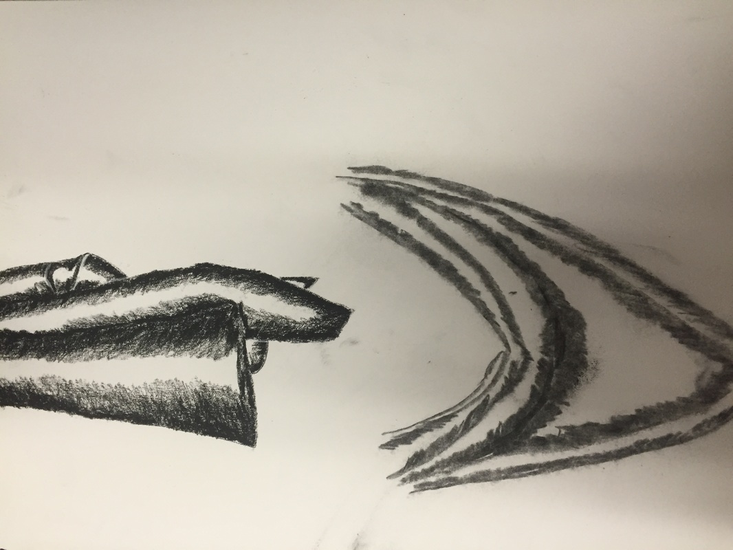 Yet another early take on different types of charcoal that went into making the final fabric piece. The right one was done in charcoal pencil and the left one was done in vine charcoal. I was not able to grasp how the vine charcoal worked and pretty much was just able to make lines. The charcoal pencil I had better luck with in creating the fabrics slopes and valleys.
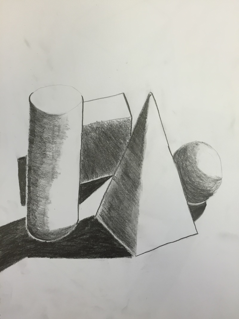
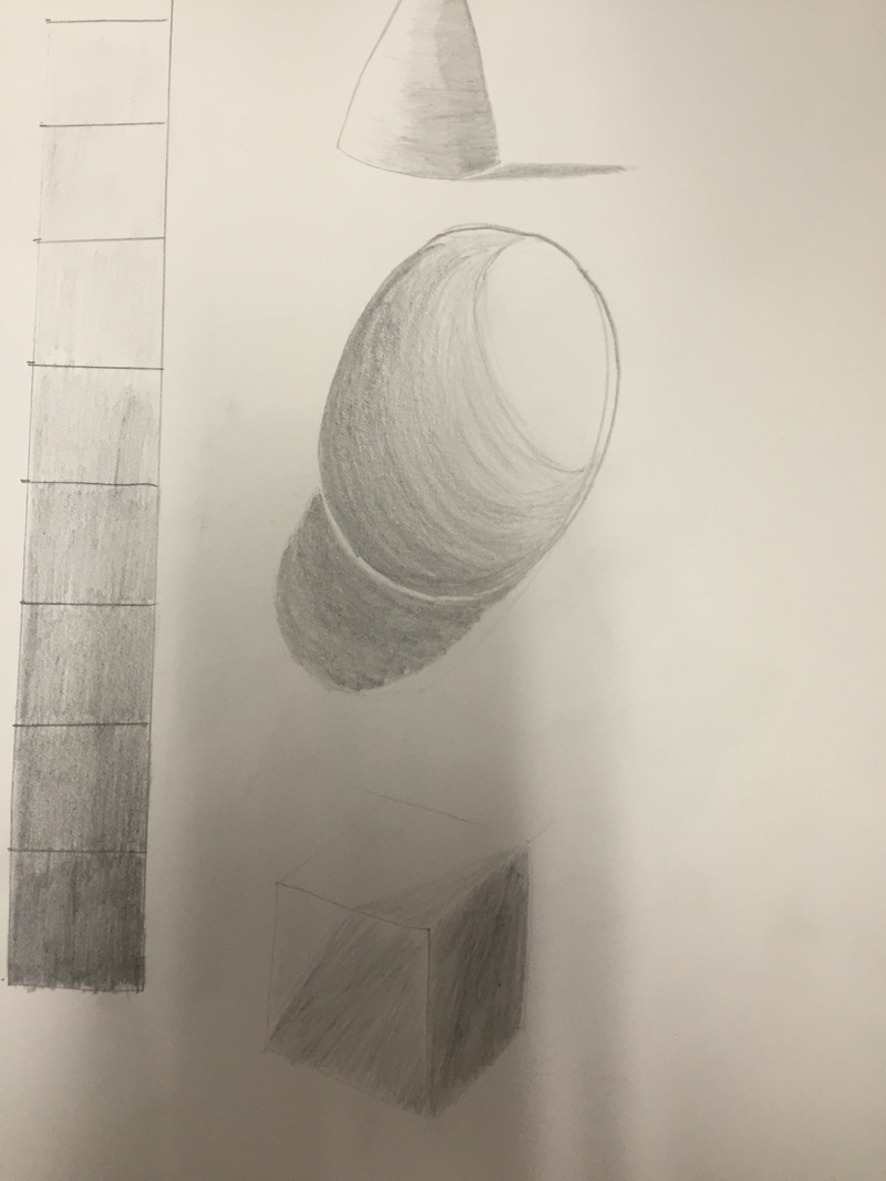 An earlier study we did of values in shapes and the dark's and lights of a value chart. We shaded different shapes such as a cone and sphere to understand how light bends around objects and how to shade accordingly. These were very early studies so they aren't as great as some of my later works.
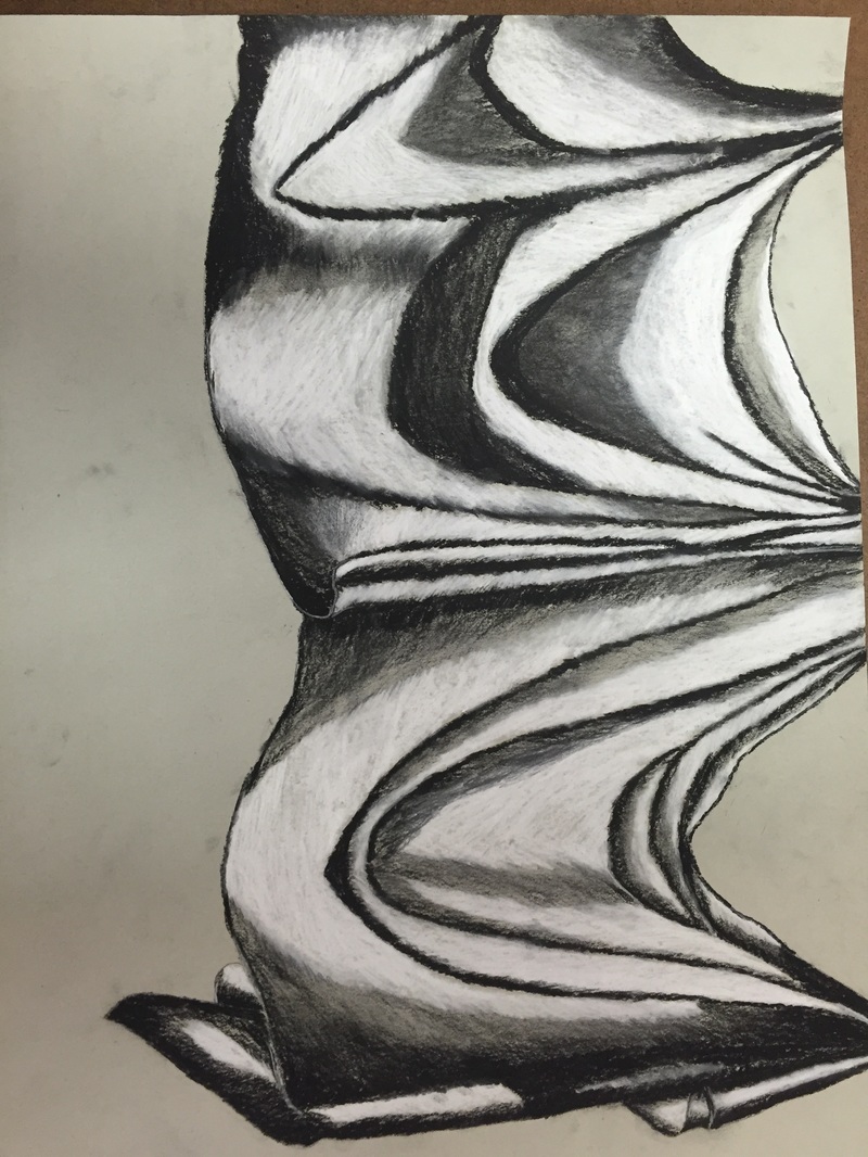 In this piece I tried to create a wide range of values throughout my process. I decided to have the darker areas of the fabric stand out which is why my areas of white were larger than what I originally planned. The in between values were pulled into the highlights from out of the dark areas. This helped create those shadows the lead to the highlighted white areas. My practice studies into fabric were very little but still had a known impact on my final piece. The practice drawings showed me how highs in lows can be achieved in fabric. The idea being that folds in fabric are just lots of cones or the sloping valleys were the fabric has been stretched out. My pressure was pretty even around the whole piece on the first go over on the fabric. After my first touch I started to darken my shadows and lighten my highlights as I began to build it up. I used my kneaded eraser to help pull out those grays to make lighter shadows were I don’t want highlights or complete darkness. Interpretation of texture helps bring out the fold in the fabric. In proper interpretation of texture often makes the fabric look 2-D and flat and or can lead to a texture that shouldn’t be on fabrics or clothes. Good interpretation of texture is essential to creating a good looking, 3-D texture for your fabric drawing. If I could do this piece again I would add more grays and tone down the size of the highlights within the drawing. The big ones turned out fine in my opinion but I always would like to know how it would have turned out had I gone a different route.
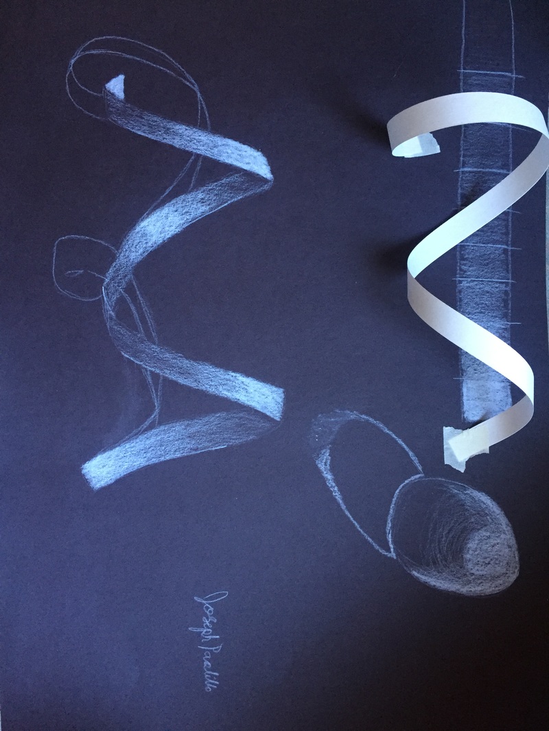 In this photo was had practice with Prisma color pencils on black paper. It was different to get used to as we had to color in the lighter areas instead of just add shadows. The shadows were there, we just had to make something for that shadow. The sphere was still me getting used to it and then we drew based off the one taped to the paper. We also experimented with values.
Backpack Contour Drawing Like the last two post we created contour drawings based off our hands. In this one we made one from out backpacks. Just like the last post we could glance at our paper, but we still couldn't lift our pen off our paper. This one was bit more challenging because I had to capture details with objects of different materials. 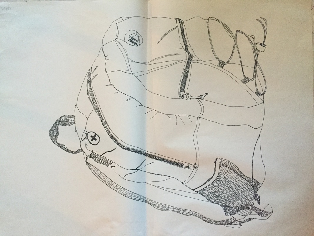 In this little practice drawing we made a modified contour drawing. The reason for it being modified being the fact we were actually able to glance at our paper as we drew our hands. I tried to capture all the details in my hand, from the lines in it to the knuckles and nails. 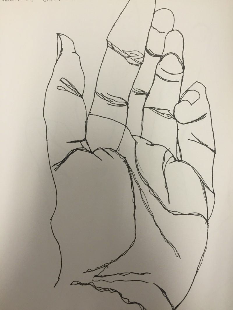 My best and. in my opinion, the most developed of my contour hand drawings. As the name suggests we had to make these only looking at our hands and not at out paper or pencil. It is supposed to help learn to be confident in your lines and to focus on the details in your subject. 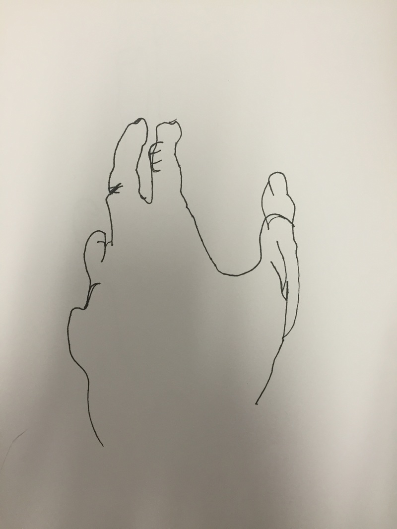 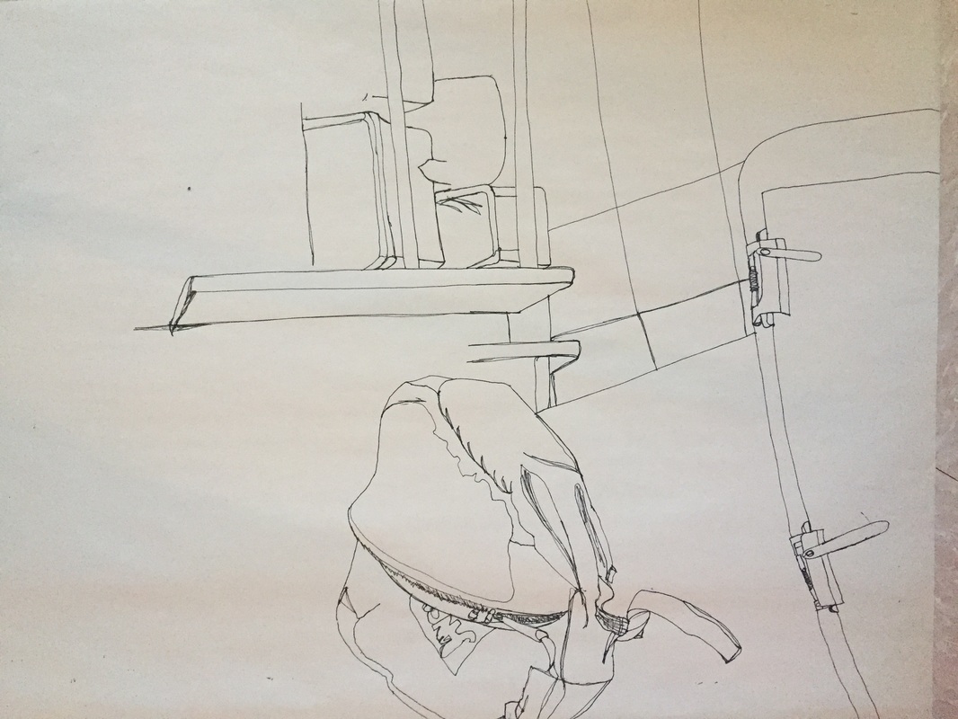 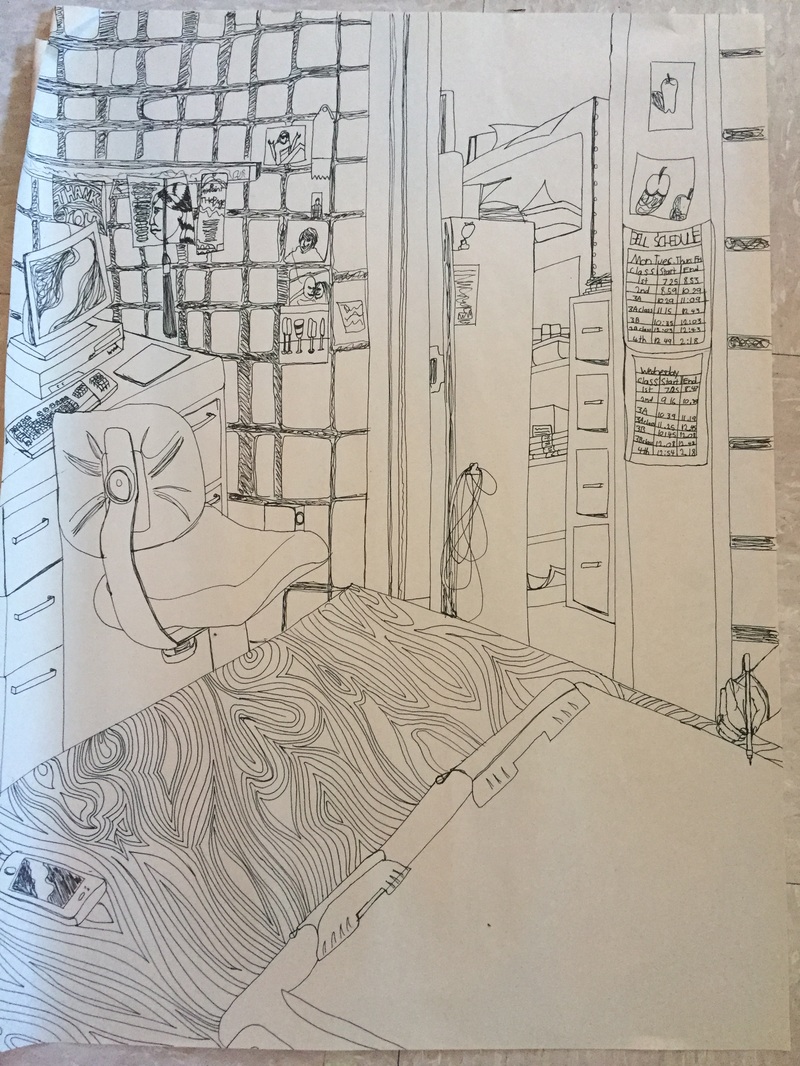 For the most part the fluidity of my line was my number one goal when creating this piece. I did, however, go against my line to draw the handles for some of the cabinets, but besides that I tried to keep one fluid line. This is evident in the shading I did for the walls and screens for the computer. This was an entire line just done in circles until I managed to shade the whole area. A way my knowledge and studies of contour drawings helped me with my line. Originally my lines were very crooked and you could see the spots were I was stopping and going. Practicing with contour drawings helped me learn how to keep going without stopping abruptly. The difference between a contour drawing and an outline is that contour drawing capture in line detail. Contour drawings will draw the inner details of an object as well as the outer edges. The interpretation of line is essential to catching the onlookers eye. The line takes the them through the drawing piece by piece. I tried to achieve this when creating this. In creating this piece I learned how important it is to draw the detail and scale of your subject. While I did learn this I do wish I didn't stop to create certain parts of the drawing and if I could go back that would be the one thing I would change.
|
