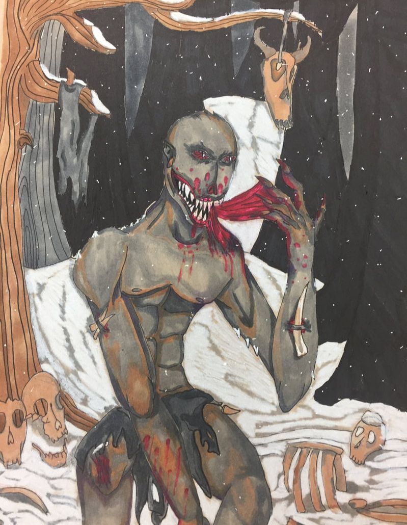
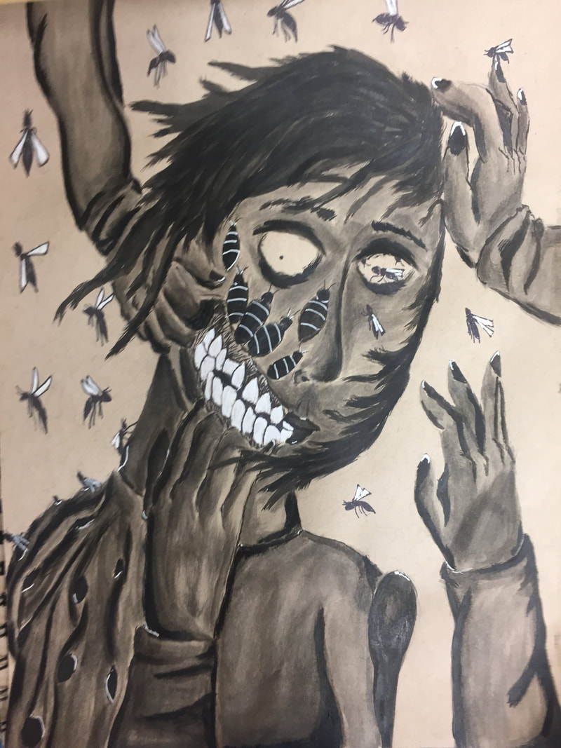
For this piece I decided to venture further into various mental illnesses that have cropped up over past couple centuries. Back then, very little was understood about how the brain works and operates in regards to mental illness. In present day we may no more, but we are far off from truly understand the complexity of the brain. That isn't even accounting for how to fix it should things go awry. This has resulted in various pseudo-mental illnesses in order to explain away why someone is the way they are. For most it was easier to say those people are crazy rather than doing any actual investigation. One of these had to do with the Native American population and their respective culture. The origin of the illnesses name has to do with an Algonquin mythological creature known as the wendigo. This creature was said to symbolize the winter, starvation, and death. The creature's spirit would influence starving travelers to resort to cannibalism to survive. If they did, the spirit would proceed to posses and physically change their victims bodies. Forever hungry, these perfect hunters seek out their once fellow human beings. While that may sound like some horror story, people once had an mental illness frighteningly similar. While it didn't mutate people the very acts it cause were certainly enough to bring fear. This pseudo-illness, known as wendigo psychosis, has been predominantly seen within North Eastern American tribes. Many of these cases involved Native Americans of the Cree tribe. The mental illness was characterized by the compulsion to eat human flesh even if food is nearby. Long story short, perfect idea for new piece. This piece was done with a pencil sketch and then a sharpie final outline. various skin tones and grays were used on the wendigo. For the background I used darker browns for the trees and whites and neutral grays for the snowy areas. Bones were done with skin tones and a blender to give a bleached look as well as cool grays. Overall, an interesting piece for a very frightening idea.
After creating the previous the piece based on a fear of flora, I felt it necessary to create one on fauna just to match. This piece is based on the fear of animals known as zoophobia. For this piece I created a pretty neutral background and made an outline in pencil. After that I went of the sketch with a final outline in sharpie. For this piece I decided to do exclusively in only copic markers. For the fur I used various neutral grays as well as sharpies to highlight the pieces of hair. For the connective between the the various animals and the human part as well, I used sharpie at first. I then went with different shades of red and for the lighter ends I used a white gel pen then went over it with red for lighter colors. I used a similar approach for the gums of the wolf. Over all I think I really enjoyed this one. I always like copic markers for their ability to create seemingly printed looks to drawn pieces. I also like the ease of blending that is not as crazy as water color but easier than regular prisma colors. Overall, I think I will be using copic markers in the future in creating for pieces like this.
This piece is the first of my concentrations featuring a full body rather than a face. I must say it is very interesting and different change of course. Obviously, more room work with in my opinion. For the start of this piece it worked out just like any other piece. I started with a pencil sketch before filling in with colors. I did all colors in groups of 3 shades. Skin,vines, and branches were all done this way. After that though, I decide to do something different. Usually I do this beforehand, but I outlined the whole thing in sharpie over the prisma. A last minute, impulse idea that I think added some definition to the piece. If I could change some stuff around, some definition in the skin and more details would be nice. I would also change the background to something for more dark for atmosphere. Overall, I think this piece was executed quite well. This piece has quite a lot of symbolism incorporated into the piece and would love to hear what people think it symbolizes. This piece was inspired by the fear of flowers aka Anthrophobia. I decided to interpret it a bit differently into an over all fear of flora. Overall, a well done piece in my eyes and one of my favorites in terms of idea and story.
For all intents and purposes this piece was quite interesting development wise. I wanted to do an idea based on a mental disorder. The first one that came to mind was multiple personality disorder. While it may not be an official disorder, the idea was intriguing enough and has just finished watching the movie Split. As for pre-sketches, most were about faces along one person's head. These ideas were not what I was going for though. Then the idea of the idea of stretched skin. The idea was gross, but the sketch was calling to me more than the others. After choosing this I went to tracing the faces. I decided to go with only 7 faces instead of the original 12. After the sketch was complete I made the decision of which personalities I wanted for my piece. I wanted as much personality in each so I went for lots of expressions and symbolic colors. The 7 are as follows:
Red- A man full of anger, resentment, and frustration. His mood is seething rage to anyone. His color (red) symbolizes his fired up mood. Yellow- A man of business if you want to put it lightly. The facial expression is one of greed and wanting everything that isn't his. Further highlighted by his monocle and jewelry. Green-This was based of the Pixar movie Inside. Green was the color used for disgust and,as such, was used to symbolize his look of disdain and disgust for the others. Blue-A drug addict. This personality is highlighted by various needles and his rather bloodshot eyes. Blue was used to show his relaxed, calm, and doped up mood. Pink- A glutton at heart. He is more interested in stuffing his fat face than anything else. Pink was used to imply the actions of this one is like that of a pig. Purple- This is the most depraved of the 7. His face is curled in pleasure and excess just because of the cut on his face. This just goes to show his perverse nature. Pink/Purple- The only female of the group. The mask is meant symbolize a narcissistic and shallow character. The cracks serve to show the facade is peeling away to reveal the real person. I did use a lot of black for this piece to specifically have a lot wrinkles for the expressions. I think this piece turned out quite well even though I used both water color and normal prisma colors. I would like to use new colors for expressions the next time I do a face. For this piece I wanted to do something more abstract in mental disorders. I decided to use a phobia as it can be the cause of real mental disorders such as PTSD. Real phobias often develop from a traumatic experience involving the item in question. While some people just don't like certain things, a true phobia is when the mere thought is enough to drive you into a panic attack. As such I will use this one as a mental disorder in the case of it being the object of anxiety and PTSD. Anyways, for this I decided the most fearful thing someone with Ophidiophobia- the fear of snakes- could think of. I believe I have succeeded well in that department. Like most I started out with a white line traced on the brown paper. After which I decided on using watercolor prismas as a base before adding the actual prisma to it. Overall I think that this a good piece but there are some areas to work on. The snake seems too cartoony and, therefore, I would like to change it if I could. Another thing I want to change is to not use the water color prismas as the effect I thought of didn't work out in the end.
For this piece I used prismacolors to create a piece based off of the mental illness of Obsessive Compulsive Disorder. This piece was slightly less human in appearance than my pieces beforehand. For this I used a white pencil sketch and I used color groups of three for different parts of the creation. I tried my best to make the most of the drawing even and completely symmetrical. The pink and purple was an odd choice that I have not tried in large amounts in any of my previous works. I actually enjoyed how it turned out with the rest of the fiery and cooler colors in the piece. For OCD, I decided this individual had a fixation on the number four and incorporated that into my piece. This ranges from the patterns in the background, to the brand for on the neck. I'm also please with the brand in making the skin seemingly discolored and irritated around it. One thing I would have added in would maybe more interesting details into the face. Although, in this case, less may have been better. Overall, I think this turned out exactly as I had it in my head. I think prismas are the way to go from now on, and that this piece is but one of many good pieces.
This will be the last of my india ink pieces. It was fun and all, but I think that the whole water color appeal to it doesn't really appeal to me. But I decided to go and make one more before I put up the brushes and ink. For this piece I created an artistic interpretation about anxiety disorder. Everyone goes through anxiety once in their lifetime, but people with this disorder have it much worse. People with anxiety disorder find this stressful emotion debilitating, to the point where it negatively affects lifestyle and ability to deal with everyday life. Unlike PTSD, this can be caused by any stressful enough situation unlike a certain action of event when it comes to PTSD. For this piece, the india inking process was about the same. I did a pencil sketch before applying light layers of ink. As the piece progressed, darker tones were added in to as the piece became darker. This piece shows how it feels when someone with this disorder has an anxiety attack. I decided to try and find what people would make them the most anxious. I decided insects crawling around you and on your skin would definitely make anyone panic and freak out. The hands were meant to resemble the afflicted attempting to get rid of the feeling (insects), but enable to as they claw away at their skin. Overall, I really appreciate the way this came out, despite me not really enjoying watercolors as a medium. From now on I probably will be developing more pieces via prismacolors and even oil paintings.
|
AuthorWrite something about yourself. No need to be fancy, just an overview. Archives
May 2018
Categories |