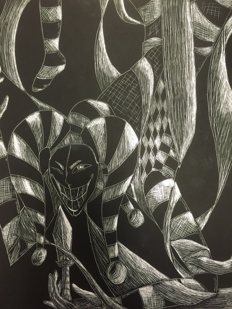
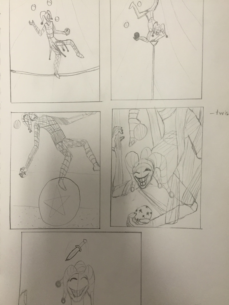
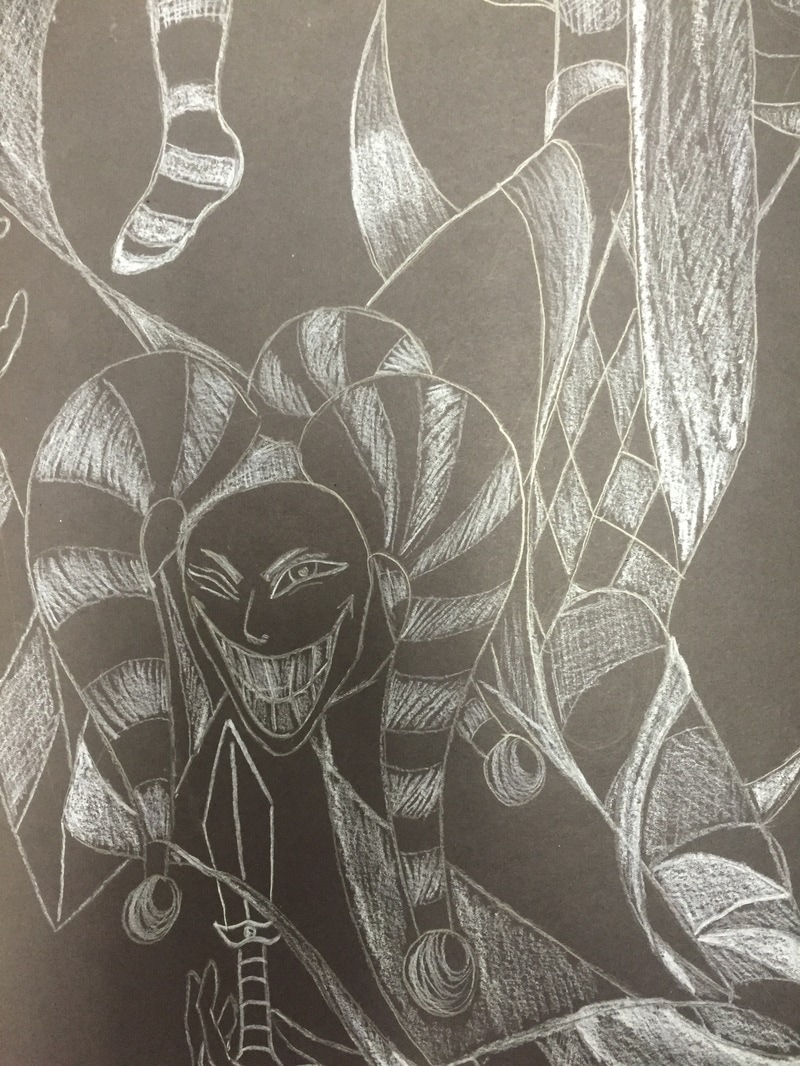
The artwork depicts a Harlequin like jester performing ribbon acrobatics while balancing sharp implements in his hand. The character dons a suit made of different patterns of fabric, a typical jester head piece, and a menacing mask with an ear to ear grin and one eye closed. This further increases the performances risk as he has only one eye to use for all the task he is doing at once. For texture I found that cross hatching was a good way to imply value change. However, cross hatching the whole thing would cause objects to be undefinable in the artwork. To fix this I used lines in one direction for the ribbons and head piece, while simultaneously using cross hatching for areas around the lines to define each individual part of the picture. As I said before, the use of different drawing techniques helped to balance the piece. The subject matter was displayed across the canvas in order to prevent it being all in the middle. I also purposely put nothing of interest in the middle in order to keep the viewers eyes from sticking to that location. Movement is implied from the ribbons as well as the knife in his hand. The ribbons, especially the ones not pulled across his body, are loose and flowing. This implies a movement of free falling in front of the viewers face. The knife is also not resting against the Jester’s fingers and seems weightless as it appears to go upward as the Jester falls downward. If I were to improve the artwork I would exaggerate the amount the weightless and free falling motion of the piece. More ribbons would be flowing instead of pulled taut against the Harlequins body. I would move the knife further from the hand and just add more detail to the mask and extra patterns to the costume. The final thing I would do to the piece would be to add more shading. As like some of my previous works the middle section of shading is lacking when compared to the bright and dark areas.
For this next project we are creating artwork using scratchboard and Xacto Knives. Scratchboard is a form of drawing by scratching our lines on black paper revealing the white beneath. I decided on a masked harlequin like jester balancing himself on different circus acts involving acrobatics. The next step involved using a white colored pencil on black paper to get a base design of what it will look like in the final piece. I also made some alterations from the sketches.
For this I will be doing prisma colors to create a robotic portrait of myself. Right here is an in progress photo of my portrait. I still have to work on the machinery and skin value changes as well as a background. I'm hoping this will turn out well.
The subject is, on paper, an android in a house that has sustained heavy injury from a past event. The reason behind this injury is unknown and left up to interpretation. Many could relate the android to terminator or other science fiction robots. The photo used for this portrait was a picture of me after my eye surgery to fix a hole in my retina. The work was made by making a rough sketch using white prisma pencil on the brown paper. This was later gone over with value whether it be highlights, shadows, or even the middle range color. I then made much of the face before cutting out areas to expose the machinery. It was all a matter of shading and deciding colors to simulate skin and robotic parts. The point of emphasis is to create an unknown story. This android is damaged but no given reason in the artwork shows the cause of this. I was thinking of making a dead body behind but leaving it to the imagination was more interesting to me. Maybe I could add it in the near future with a hint of blood reflection highlights or the highlights in the metal to reflect a dead body.The android really goes for what I had in mind and that I would be creating the apathetic. This android is lifeless and I tried to simulate that with any lack of reflection or light in the eye. This really gives off a lack of emotion for whatever he just did to cause his injuries and exposed machinery. I wanted audiences imagination to interpret the scenario. Maybe he went all terminator or maybe he was in an accident. I wanted the audience to formulate their own ideas. One thing I felt was successful was the proportions of the face and putting to paper what I had envisioned. The main failure would be the background. It was meant to be blurry to represent the damaged and malfunctioning view point of the android. However, even though I swung and missed heavily on the background design, I think that this background had a more of an idea behind it than my opacity project. The opacity was just kitchen background an lacked any real addition other than taking up blank space. Overall, my mindset for this project was to swing for the fences. Some areas were a home run but other areas (background) I missed horribly. If I were to do another portraiture I would go for it no matter the outcome. It gives me a since of what I can accomplish and what I need to work on. For this one I need to put time in my ability to make a background.
For the ear I took a selfie of my own as a reference photo. Ears have dozens of valleys and chills in them so I tried to show that with my value. I made a rough outline of the ear and very light sketches of the different areas. The inner aand bottom areas were given the most shading while the areas that rose up were given more value on the edges to simulated a 3D aspect. For this one I made the outline of the lips as well as the texture of the lips by make lines on them. To prevent it from looking like hair I used a 6B pencil to darken them up and shade around an area of highlight on the lower lip. The rest above the lip was done by just shading. For the nose the nostrils were the only thing that I drew using lines. The bridge of the nose and the edges were done just by shading alone. Overall, this I felt was well done for a practice but different value change could have made it more realistic. Depsite the eyes being the hardest to re-create, I really enjoyed drawing. For this I made a football shape and altering it into the shape of an eye. The next thing I did was make circles to create the iris, cornea, and the eye ball itself. after shading in the eye and add highlights I made eye lashes and shading outside the eye to simulate how our eyes are sunken in on our face. This full portrait was done over a printed out skull in order to practive proportions on a full human skull. The mouth, nose, and ears were easy to get the proportions down right but the eyes were slightly disproportionate wiht the face. The shading was also off and the hair could have been done better. Overall, the eyes and shading are my most important things to work on. The hair is okay but could be improved.
In the creation of my piece I started to do the background and base colors first with colored pencil. The cellophane wrap was done in pastel chalk so I was easier to fade out. The drawing itself was neat but it’s was hard to maintain that neatness when using the chalk. I wanted to keep it all white but the prisma began to blend in certain areas on the sushi itself. The background was meant to keep a kitchen like feel as if you were in one. The tan walls and tiled ones near the stove help to keep the aesthetic. The blue counter tops were a poor choice in hindsight but I wanted it to stand out from the slightly monotone background. That being said I think that the blue contrasted with the red tiles quite well and the red stove knobs help stand out from the white. The cutting board I felt gave it a more natural feel then just the dull feeling of a modern stove. Only a slight amount of shadows were used as the stove lamp as shining on top of the piece. However the shadows helped to separate the chopsticks from one another and to create and overhang on the cup that held the wasabi. The wood texture on the cutting board helped in giving life instead of a bland tan. The background color was meant to keep a similar feel to the kitchen setting but I also attempted to make details in areas (the individual red tiles) to make it less droll. The skills needed for pastel help to create the cellophane wrap. Understanding how to fade out the pastel helps to create this texture as well as others should you choose to do in your artwork. Without this it just looks like a bunch of lines and lacks any form of texture you may or may not be trying to accomplish. The most difficult thing I found to do in the creation of this drawing was the cellophane wrap. Although I came out average I believe I could do better with it. Another thing I would improve would be my detail in the stove, as it lacked any form of detail besides the few that I put in. My 20 ideas for what could have been my final artwork above. Pre-sketches of the sushi from different angles. I tried to establish vanishing points with a pen in each sketch.
These were my introductory projects for the use of pastel chalk and colored pencils. This is the first time I used pastels and have basic if not less experience than that. For colored pencils I have a par level of experience and have gotten better. For each of them I made a rough outline in white and then started to add color. Blending was the next part as I used a dark or lighter color with the base to create details in the object. The chalk was harder than I expected and had to worry about muddying it up in the process. The pastel pencils were more effective in details but the chalk was good for blending, even when it can be a double edged sword. Dum Dum, M&M, and Smarties creation
Both the M&Ms and Dum Dum were done in colored pencils. For both of them I drew a faint outline in white to get a feel of what I wanted in the piece. In both I made out folds before hand and then decided on how I was gonna show these. For the M&Ms I used darker browns to show folds and creases within the packet and more brighter colors were used for package labeling and the logo. The Dum Dums were a different treat (no pun intended) in terms of color and labeling. The most of it was white so I had to plan out shadows and colors even more. I also had create the design as if was folding with the plastic covering. The smarties ,on the other hand, were done completely in pastel. I drew out the form in white and then got work on the logo and each candy piece. I had to block out areas where the highlights for the plastic covering would be. The last part was doing the crumpled parts of the plastic wrapper and cleaning the excess chalk pastel up as best I could. In the shapes I attempted to create value using different techniques. These techniques, such as cross-hatching and negative drawing, were used for values within the circles. The apple was done with a mix of all three as a bit of an experiment. The final study I did was of the pumpkin. I created value changes by placing my lights, darks, and then creating the middle ground of color. The stem had various layers of browns and greens mixed together.
I tried to create an interesting point of view by taking a part of a picture and focusing on that part in particular. I think it was successful because the piece makes the audience eyes go down the line of stuffed animals hanging up above the arcade stand. The reason this is so important is to create realistic landscape and environment. The world is 3D and drawing things out of perspective makes it 2D, flat, and altogether less interesting and dynamic piece. I think that the colored pencil exercises where important to understand how to layer. The stuffed animals were entirely made of cylinder and circles so I needed to learn how to layer color on these different shapes. The fur was also an extra exercise needed in order to make the stuffed animals look more like ones you would see at the State Fair. Fur was one of the main techniques I had to use within this drawing. It consisted of drawing multiple small lines to create a fur like texture. The usual layering of colors then created the shadows, mediums, and highlights on the fur of the stuffed animals. The perspective was of someone getting down an animal for someone (probably a kid) who won a prize. I believed the fore and middle were well done as the dog stuffed animal is larger (foreground) than the stuffed bear and seal (middle ground). The background was a clear blue sky at around in the afternoon. This part had less depth than I think it could have and would be something i would like to go back on later. Colored pencils in general have their own pros and cons when it comes to creating detail in drawings. If you put down the wrong layer of color (darker before lighter) this could seriously mess up the drawing and all the work you put into it. Despite this I found it easy to use without the fear of smearing the drawing as is the case with charcoal and pencil. While I did find that I was readily prepared for a colored perspective, I think a few texture techniques should be taught should someone want to take on a more ambitious project.
Prisma Final Sketches and Ideas likw.These sketches were designed for an upcoming full product, prisma based one point perspective piece. Four drawings were quickly sketched in order to get a feel for what I wanted to do. I then chose the hanging prizes to base my final upon. Below is a work in progress of what the final will look like.
|
|