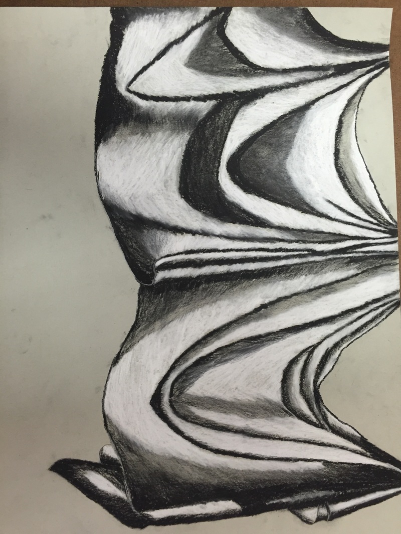
In this piece I tried to create a wide range of values throughout my process. I decided to have the darker areas of the fabric stand out which is why my areas of white were larger than what I originally planned. The in between values were pulled into the highlights from out of the dark areas. This helped create those shadows the lead to the highlighted white areas. My practice studies into fabric were very little but still had a known impact on my final piece. The practice drawings showed me how highs in lows can be achieved in fabric. The idea being that folds in fabric are just lots of cones or the sloping valleys were the fabric has been stretched out. My pressure was pretty even around the whole piece on the first go over on the fabric. After my first touch I started to darken my shadows and lighten my highlights as I began to build it up. I used my kneaded eraser to help pull out those grays to make lighter shadows were I don’t want highlights or complete darkness. Interpretation of texture helps bring out the fold in the fabric. In proper interpretation of texture often makes the fabric look 2-D and flat and or can lead to a texture that shouldn’t be on fabrics or clothes. Good interpretation of texture is essential to creating a good looking, 3-D texture for your fabric drawing. If I could do this piece again I would add more grays and tone down the size of the highlights within the drawing. The big ones turned out fine in my opinion but I always would like to know how it would have turned out had I gone a different route.
