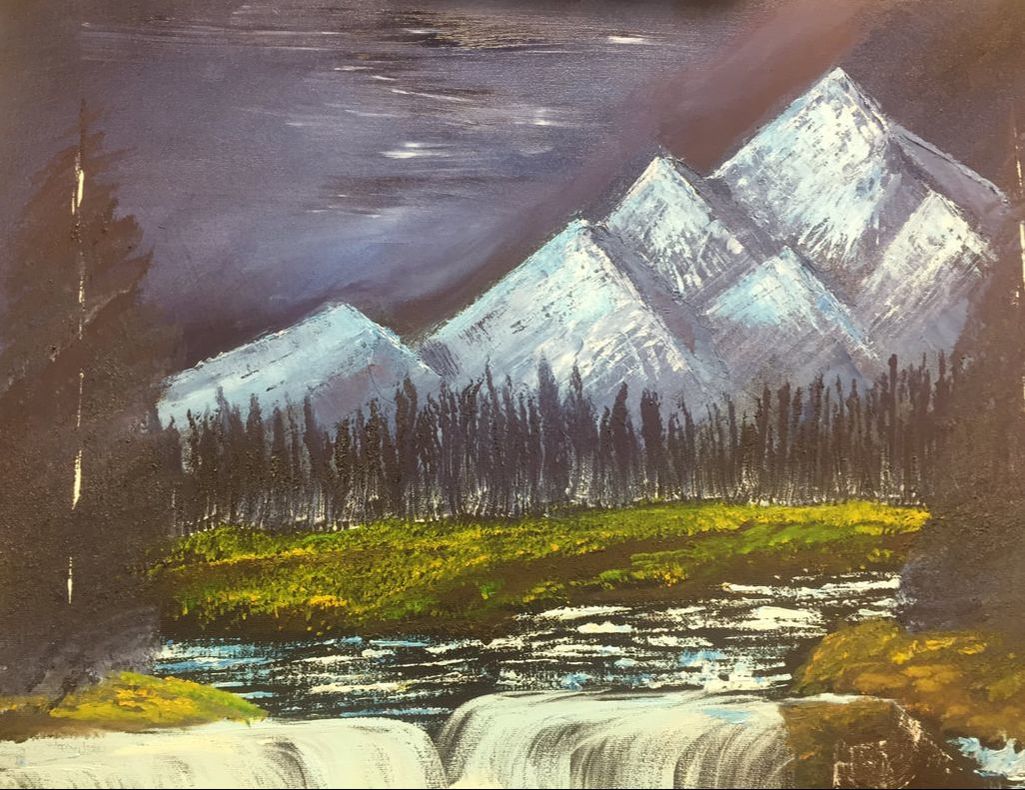
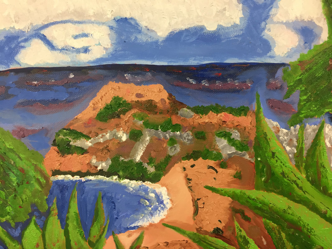
For this painting I used a video of Bob Ross painting as inspiration. He was making a painting called "arctic beauty" and I decided to follow along as I have always wanted to do something like that. To start we had a black and dark purple canvas as the base color. Afterwards a lot of blue and white over more purples made a mountain range in the background. I then made a treeline using dark purple and then white for highlights to simulate trees. The next thing was to use green and yellow to make grasslands and then brown for the dirt down under it. More blue and white was used on a palette knife to make water and then a fan brush for the water fall. The rest of the trees were done in purple and white as well. Over all, I am really proud of this painting even though it was frustrating at times. If I could do something differently, I would like to do the mountains differently in order to better look like a rocky mountain side.
Overall, I really did enjoy my time in the painting class. I made some friendships and even got a few laughs out of the whole wonderful experience. As for projects all but one was enjoyable. Sorry, but water colors are just not my thing. It was kinda frustration for my first piece, but I am glad it was not the last. I enjoyed the Hunderwasser painting as it was different to doing a 2D painting when all I have done were about 3D illusions. The portraits I have come to love. I have fell in love with portraiture of both people and animals alike and, as a result, have come to love our portrait paintings we had. They were one of my favorite projects to work on and I enjoyed the progress of how my portraits becoming more anatomically correct. Another thing I enjoyed was making hair with acrylic. This was very useful to me and I think it shows in my pet portrait I made. Overall, the smaller exercises and bigger projects really helped me excel to be better at painting and making lovely works.
For the pet portrait I decided to do one of my dogs as I had already used my cat for another similar portrait. I decided to use a technique involving a pre-painted canvas. This involved using burnt sciena in order to create a fully valued piece underneath the final layers. After that I used black and white as very exclusive colors as my dog's fur. My dog has various light browns in his muzzle so I wanted to incorporate that as seen in the reference picture. As you can see I did not want a black background so I decided on a red background. I then changed the collar to blue so I would just blend with the background. I decided on a dark pink for the ear and the whole. The rest of the face was build up of grays and a bit of white. I also added some whites for the fur and finally the brown. Overall, I think I could of done things a bit differently. I feel like I could have used more water to make the fur more "whispy" looking. Another think I could have done better was the reflection in the eye to be better. Aside from that, I am proud of this piece and would like to keep keep this in my home. For this I really didn't have many landscape photos on my phones so I had to borrow some photos for this one. This picture out of all of them was the best in what I wanted for a landscape. After some simple sketches I did an orange wash on a canvas to start with. I decide to do darker blues for the ocean in order to contrast with the lighter blue of the sky. For most of the areas I did a basic smooth texture for everything to figure out colors. After that I would load my brush with paint and "tapped" the canvas to create texture in the clouds and landscape. I did not do this for everything so I could break up the background and the foreground. If I ever wanted to do something different it would be to do a more detailed work on the mountain areas of the the piece. Another thing would be to change the water colors. Overall, I am happy with how the landscape came out and that the "less is better" concept worked really well.
Oil Painting Still LifeFor this practice we did a still life arrangement consisting of various fruits and vegetables. For the the practice I did a wash of contrast colors to start with. For example, I did a wash of red on the pepper j was gonna paint green and so on. After that I did a base color of all the various objects. I then went over them with darker and lighter shades and topped them off with highlights. Overall, I think this practice gave me a better understanding of how properly blend the various oil paints without over blending. I would like to get better at the use of shadows later down the road.
For painting we did our own oil painting practice in preparation for our landscape piece. I chose blue berries as I haven't done them before. For this one we used a pallet knife to show how work with large areas is where the knife shines. I quickly applied all different shades of blue on the berry before using warmer colors for the ground and the sky. Overall, I am starting to understand how to use the pallet knife in terms of shading.
For this piece we decided to base it off the works of famous painters Hundertwasser and Klemt. There specialties involved the use of transforming landscapes into various two dimensional, and simplified into basic forms upon the canvas. My references were originally based of a backyard with a house in the background, but you would not even know that by just looking at the finished product. These sketches still don't have any similarity to the original picture, a feature I enjoyed in the process of creating this artwork. After some transforming and reforming, I was ready to pet paint to canvas. Hindsight is 20/20 so a wash on the canvas like burnt Siena may have been a better choice than the titanium white background I chose to work with. This caused a bit to show through but no matter, the colors were what I really wanted to go for in this process. I have always found the acrylic to be good for making bold and bright colors, specifically ones like yellow and pink. I used these both in my artwork to a certain extent, pairing them with complementary colors in the piece. For a border I chose a classic red and blue pattern to outline the once normal landscape I had created. In many of Klemt's works he had various eyes placed in it for various reasons. I found this idea to be quite interesting and made the design choice of inserting them throughout my canvas. As for value changes, which I usually strive to add in, I decided against them for a more 2D appearance based off the artist's work. After the paint had dried entirely I used a silver marker in order to embellish designs into the paint, often this involved the use of spiral patterns and interior outlines with webbing designs in areas as well. The most difficult thing with this piece was how fast acrylic dries. For term of time it works well, but getting a good amount of paint on before drying was slightly annoying. Another setback I had was redoing lines if I messed up on them, taking up about 1/4 of a class period to correct. Overall, this piece I believe was more of a success then a rejection, and the only thing I would fix would be a more various color choice for a more psychedelic effect.
For this artwork I would like to say that watercolor was never my forte. I have gotten relatively better but I still just don't like how the paint moves and judging the correct amount of water. This often cause me problems like splotches of paint here and there on my painting. That being said, I figured flowers would be the most appropriate for my first, and probably last, watercolor painting. These pictures were taken from my mom's flowers she had been taking care of in our backyard from multiple angles. I eventually decided to use the picture with the as many colors I can get. This allowed me to prevent the painting from blending into a mess when too much of one color was together. to do the stalks and leaves I went with a basic design of green with a more blueish green to create lines for the "veins" of the leaves. The next step was defining each of the petals on the main flowers in the piece. While challenging at first with the first yellow flower, I managed to figure out a system of blending with the paint. I would start off thick with paint and pull it to the other side of the petal. This created a blend that made each petal stick out better than just painting it all in one shade. The yellow flowers I did something different involving some browns and darker yellows added in. Despite these challenges, I managed to achieve in some respect the desire shading and blending I wanted. Overall, if I was better at watercolors I would be able to do more however this will do for now.
For this we did water color on a fruit of our choosing. We had to pain them in different colors schemes. The top apple was done in cool while the middle ones were done in warm and triadic schemes. The last one was monochromatic which meant I had to use different values to make that apple. I mostly experiment with different ways of applying shades of color and I realize that more water might have been better. Another thing I was struggling to do was keep it wet so I could prevent splotches from appearing in the piece. Lastly, I think the shadow and highlights in water color are easy to make as long as you know where the point of light is coming from. for this picture we had to learn the different techniques with water color paint. Some of them were simple dry brushes combined with wet paper or vice versa. Others involved the manipulation of paint to create different values. The most interesting of all was the addition of different substances in order to create texture such a as salt or Saran Wrap. Over all these techniques I especially liked the Saran Wrap
Today we started to experiment with Prisma color pencils and water color pencils. I have had multiple experiences with Prisma so it was something I was used to but still wanted to better perfect. Water colors were mostly new to me as I had only used them awhile back. The cube was done in Prisma and was unfinished as I decided to take my time to layer the shades of color onto the object. The second cube was done with water color. For the most part, I am not a big fan of water color as the piece can get muddy if your not careful. I also found that trying to blend cool and warmer colors can cause a smeared look I do not like. Overall, water colors may be fun if I can learn to blend effectively and with certain colors. This last one was a simple shape shade of a circle and a chart to show darker and lighter shades. I realized while doing this that keep the water color slightly wet at times can stop it from drying, getting rid of unneeded marks.
|
Author"Art should mean something to everyone." Archives
January 2018
Categories |