These were my introductory projects for the use of pastel chalk and colored pencils. This is the first time I used pastels and have basic if not less experience than that. For colored pencils I have a par level of experience and have gotten better. For each of them I made a rough outline in white and then started to add color. Blending was the next part as I used a dark or lighter color with the base to create details in the object. The chalk was harder than I expected and had to worry about muddying it up in the process. The pastel pencils were more effective in details but the chalk was good for blending, even when it can be a double edged sword.
Dum Dum, M&M, and Smarties creation
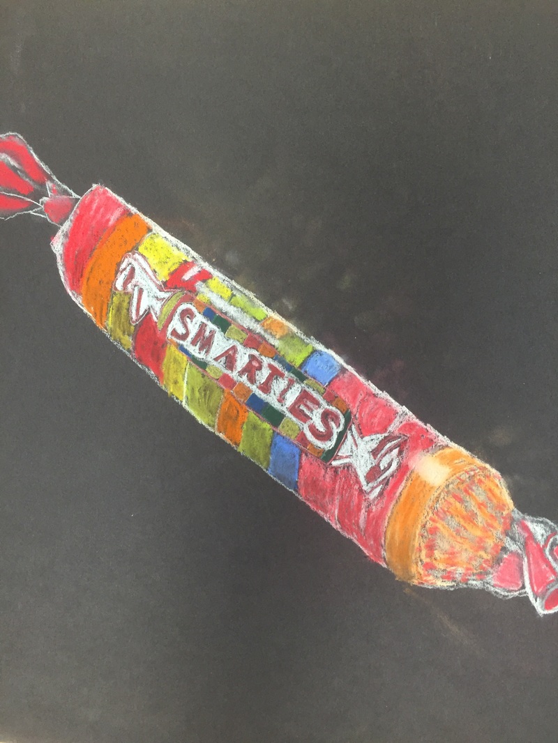
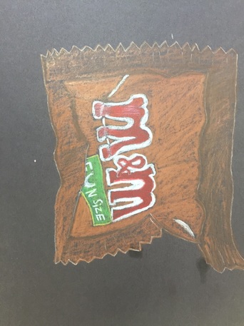
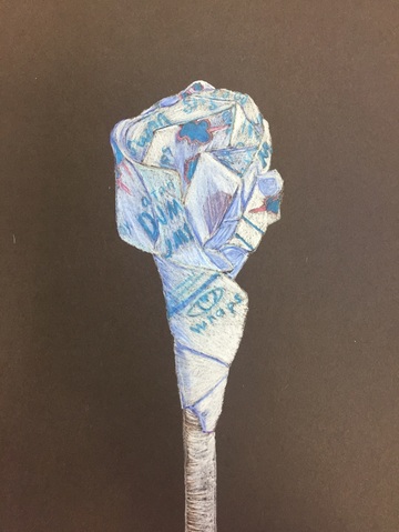
Both the M&Ms and Dum Dum were done in colored pencils. For both of them I drew a faint outline in white to get a feel of what I wanted in the piece. In both I made out folds before hand and then decided on how I was gonna show these. For the M&Ms I used darker browns to show folds and creases within the packet and more brighter colors were used for package labeling and the logo. The Dum Dums were a different treat (no pun intended) in terms of color and labeling. The most of it was white so I had to plan out shadows and colors even more. I also had create the design as if was folding with the plastic covering. The smarties ,on the other hand, were done completely in pastel. I drew out the form in white and then got work on the logo and each candy piece. I had to block out areas where the highlights for the plastic covering would be. The last part was doing the crumpled parts of the plastic wrapper and cleaning the excess chalk pastel up as best I could.
Both the M&Ms and Dum Dum were done in colored pencils. For both of them I drew a faint outline in white to get a feel of what I wanted in the piece. In both I made out folds before hand and then decided on how I was gonna show these. For the M&Ms I used darker browns to show folds and creases within the packet and more brighter colors were used for package labeling and the logo. The Dum Dums were a different treat (no pun intended) in terms of color and labeling. The most of it was white so I had to plan out shadows and colors even more. I also had create the design as if was folding with the plastic covering. The smarties ,on the other hand, were done completely in pastel. I drew out the form in white and then got work on the logo and each candy piece. I had to block out areas where the highlights for the plastic covering would be. The last part was doing the crumpled parts of the plastic wrapper and cleaning the excess chalk pastel up as best I could.
