Art II Final Exam blog
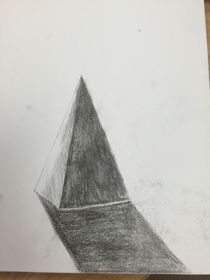
See my blog post of the perspective drawing for before
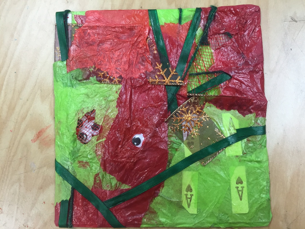
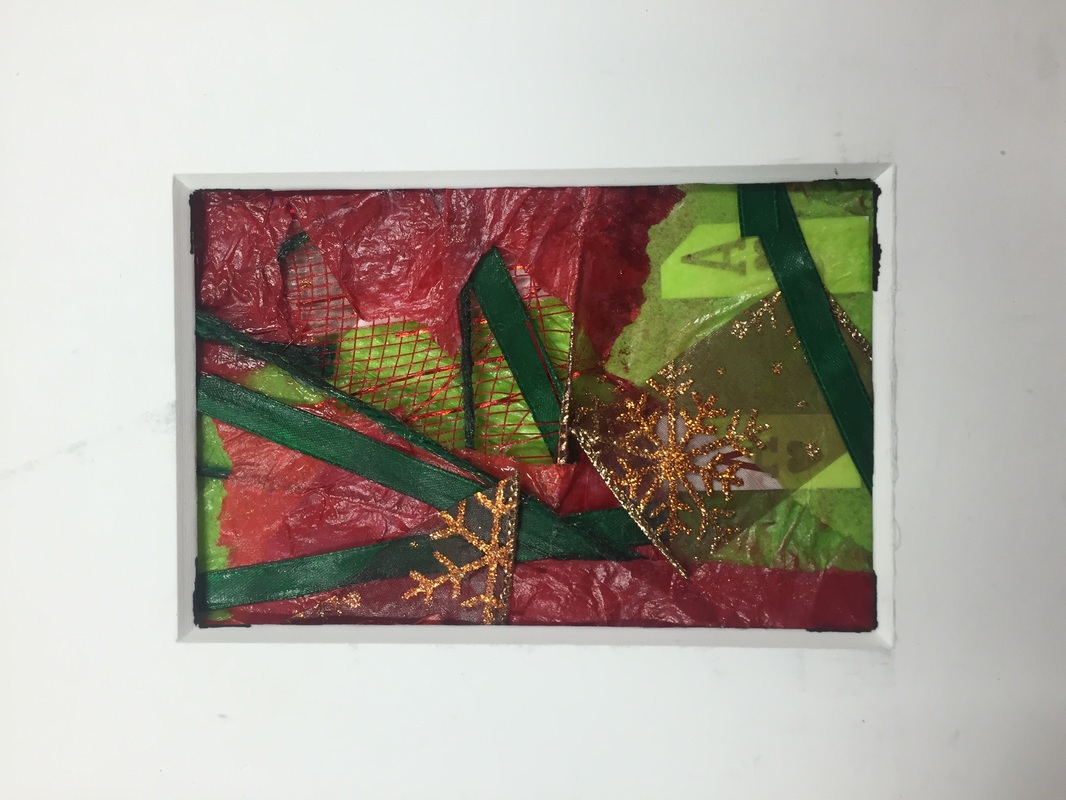
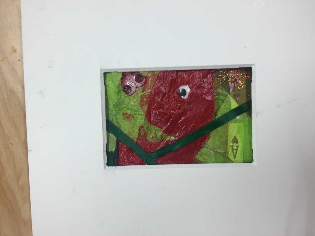
This piece titled, "Crazy Christmas", was created using a variety of art supplies, non-art supplies, and a whole lot of glue. The credit for this artwork goes to Joseph Paolillo. The artwork seems to be spliced together from tissue paper, ribbon, thread, and what seems to be golden Christmas themed wrapping. Googly eyes appear to be starring through wholes in the paper and a layer of cross-hatched paper of some sort. The first picture clearly places it on top of a table and then the others have fixed the eyes of the audience with a smaller portion of the art. The first thing to notice was the eyes that seemed to stare at the viewer no matter which way you turn the piece ( I guess laying it down got rid of that). The tissue paper wasn't void of texture either but instead has depressions and rising hills take shape on a usually flat landscape. The light helps manifest this texture onto center stage helping us see whats going on underneath the layers. The artworks means Christmas time to me and I put things in there to represent different things. The color symbolizes Christmas at it's base level, the card represents the presents wrapped in paper and waiting to be opened. The eyes even symbolize my little brother who always try to find where we hid the presents. I feel that the art work creates a sense of surrealism when you look at it. The only places it falls short is blank space in certain places. While not the best of the best it certainly depicts how mixed media should be. Mixed, duh.
This piece titled, "Crazy Christmas", was created using a variety of art supplies, non-art supplies, and a whole lot of glue. The credit for this artwork goes to Joseph Paolillo. The artwork seems to be spliced together from tissue paper, ribbon, thread, and what seems to be golden Christmas themed wrapping. Googly eyes appear to be starring through wholes in the paper and a layer of cross-hatched paper of some sort. The first picture clearly places it on top of a table and then the others have fixed the eyes of the audience with a smaller portion of the art. The first thing to notice was the eyes that seemed to stare at the viewer no matter which way you turn the piece ( I guess laying it down got rid of that). The tissue paper wasn't void of texture either but instead has depressions and rising hills take shape on a usually flat landscape. The light helps manifest this texture onto center stage helping us see whats going on underneath the layers. The artworks means Christmas time to me and I put things in there to represent different things. The color symbolizes Christmas at it's base level, the card represents the presents wrapped in paper and waiting to be opened. The eyes even symbolize my little brother who always try to find where we hid the presents. I feel that the art work creates a sense of surrealism when you look at it. The only places it falls short is blank space in certain places. While not the best of the best it certainly depicts how mixed media should be. Mixed, duh.
Question 1 and
I believe that my painting art work was the most successful piece that I created throughout the whole semester. The theme was based off the works of Takahsi Murakami, a Japanese artist know for his surreal paintings and drawings. In order to make this piece I created sketches of what I was going to outline onto the canvas. I decided to do a complementary wash in order to make the colors brighter and to remove any white showing from the canvas. A beneficial choice I made for this painting was to outline the picture in black paint with a small brush, further rendering it from the sky blue background. The lack of shadowing was used to create the 2-D effect that murakami's artwork displays.
The mini lessons that I think were most effective this semester were the shadowing techniques and practicing the use of different mediums for our colored drawing project.
The mini lessons that I think were most effective this semester were the shadowing techniques and practicing the use of different mediums for our colored drawing project.
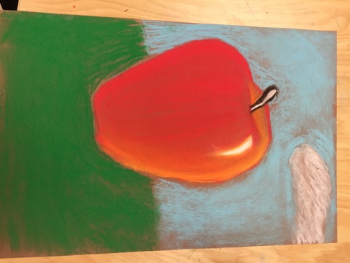
I feel that the instruction in these lessons were enough to ensure we could produce a successful piece for the upcoming project. The shadowing of shapes helped us with shadowing in the perspective project. Practicing chalk, water color, and colored pencil gave us a variety of directions we could take the art piece. The time constraints were a bit annoying but we have shown we can produce art in various forms and mediums. It's been a great time in Art II and I wish ya'll a great 2nd semester!!! I'm out.
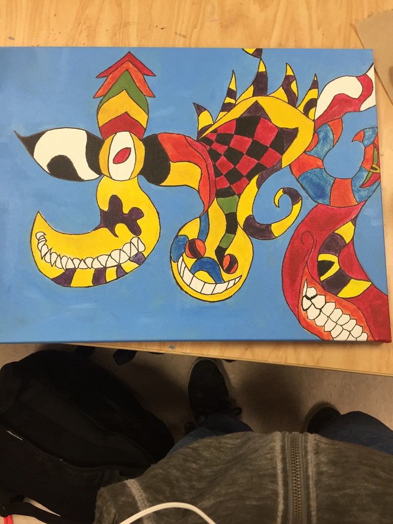
This was the most successful piece I have ever created in art II. It really has a more personal tone with art style being one that is completely random and crazy. There is no real purpose for anything but in an art piece everything has some sorta meaning. Its these kinda pieces that actually make you think about the artwork and what the artist had in mind. The complementary wash really brings out the bright in the colors.
